Back
Identity
July 20, 2021

Basil – A Healthy Kitchen Logo Design

Designing a Brand Identity that Represents the Fresh and Organic Values of Basil – A Healthy Kitchen

Task

Developing a Brand Identity for a Fine Dine Restaurant

  • Strategy

    Branding

  • Design

    Logo Design, Brand Identity Design

  • Client

    Basil

Challenge:
Designing a Brand Identity to Make Basil - A Healthy Kitchen Stand Out in a Crowded Market

Basil – A Healthy Kitchen needed a brand identity that stood out in a highly competitive market and positioned it as a healthy and premium dining option.

Solution:
Using Organic Elements to Create a Premium Brand Identity for Basil - A Healthy Kitchen

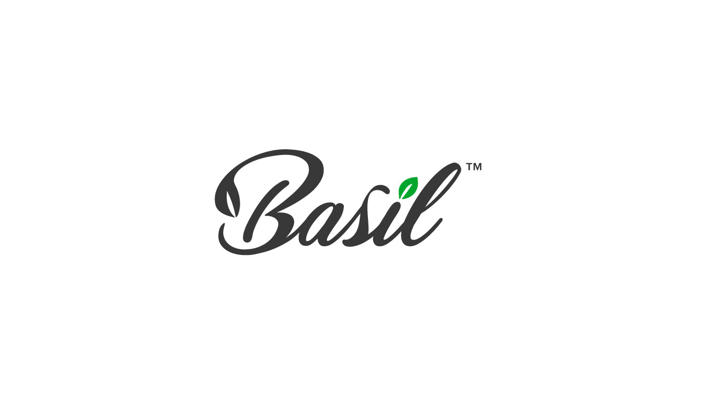
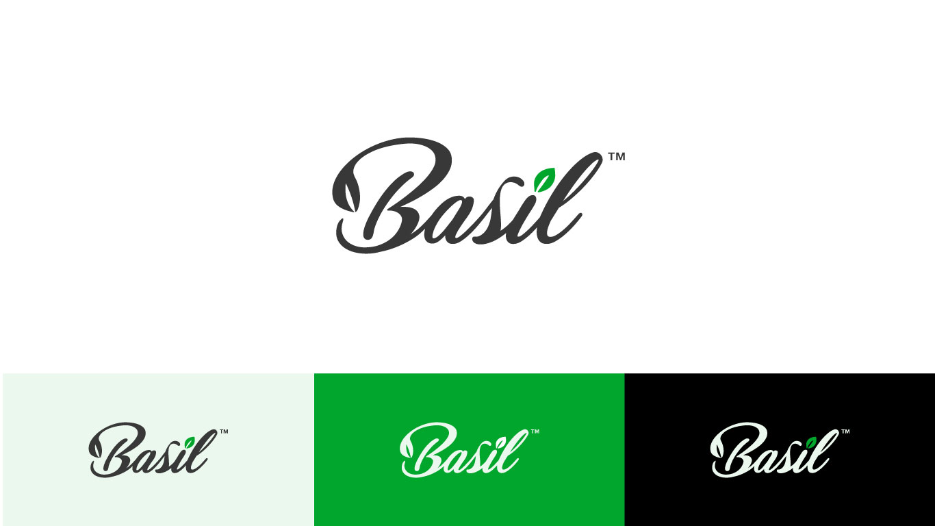
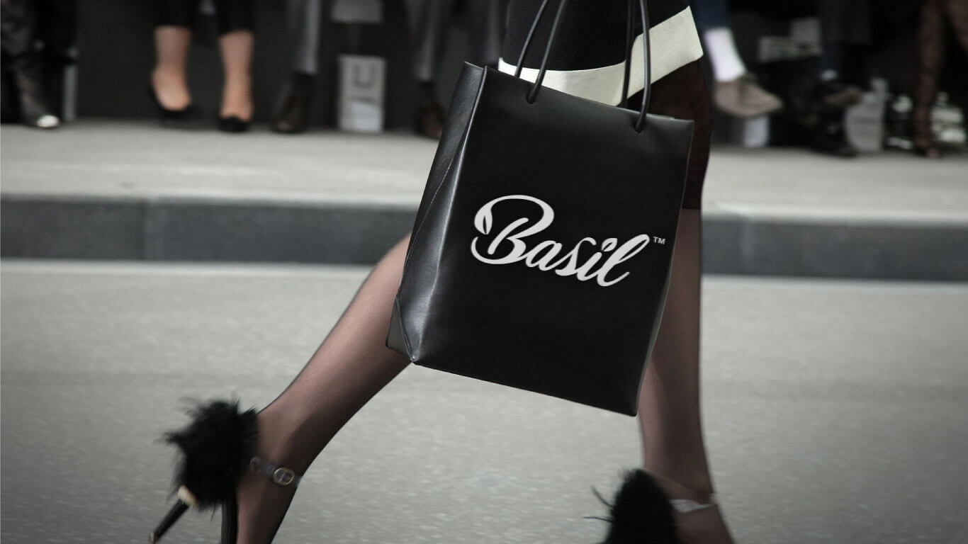
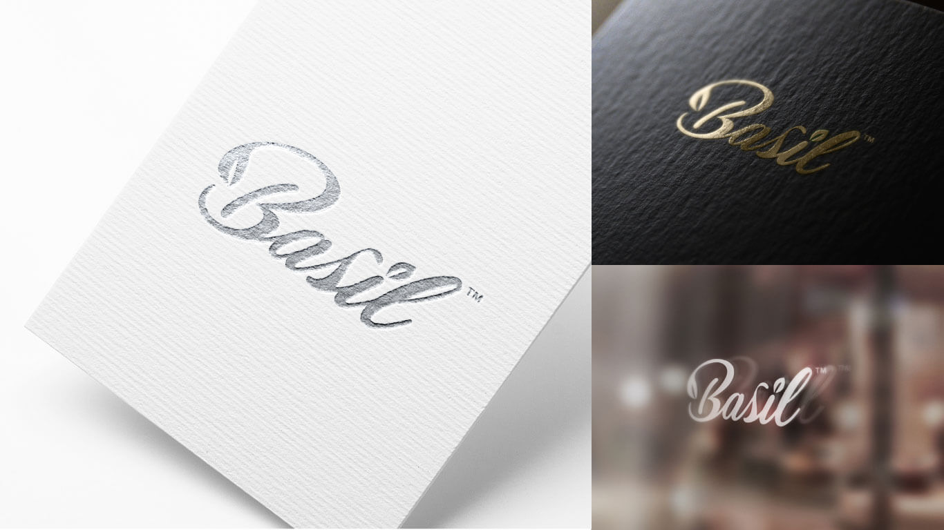
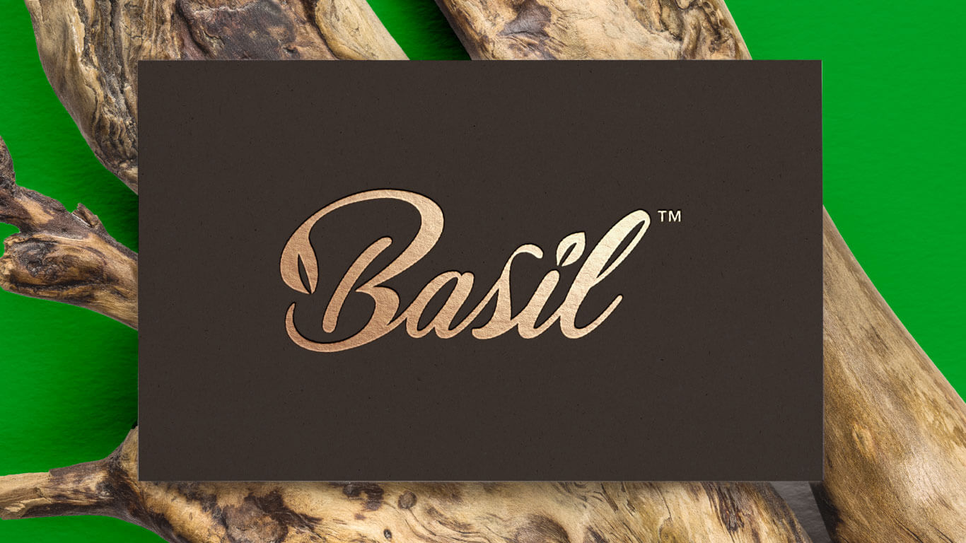
We conducted research and used the basil leaf as a part of the dot on top of the letter “i” and a cursive font to create a friendly, organic brand identity. Dark charcoal gray and green colors were used to represent elegance and health. This helped the restaurant stand out and attract its target audience, differentiating itself from the competition.

Logo Designing:
Type - Word-Mark Typographical Logo

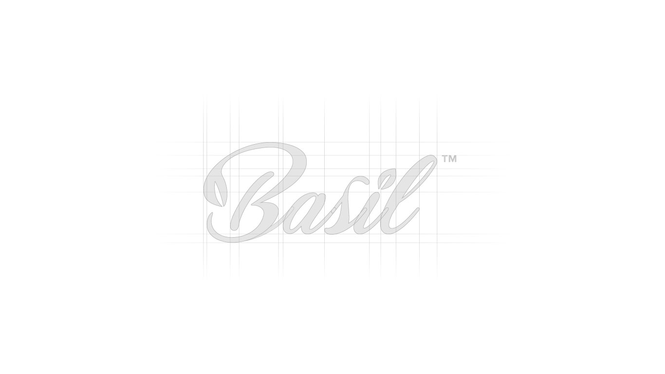
The logo features a cursive display font with a basil leaf on top of the letter “i.” The basil leaf represents the restaurant’s focus on fresh, organic ingredients, and the cursive font represents the restaurant’s friendly and approachable atmosphere. The dark charcoal gray color is used as the primary color to represent the restaurant’s elegance and class, and the green color represents the organic and healthy aspect of the restaurant.

Before After

Results:
Brand Identity Design for Basil - A Healthy Kitchen: Elevating the Restaurant as a Premium, Healthy Dining Option in Qatar

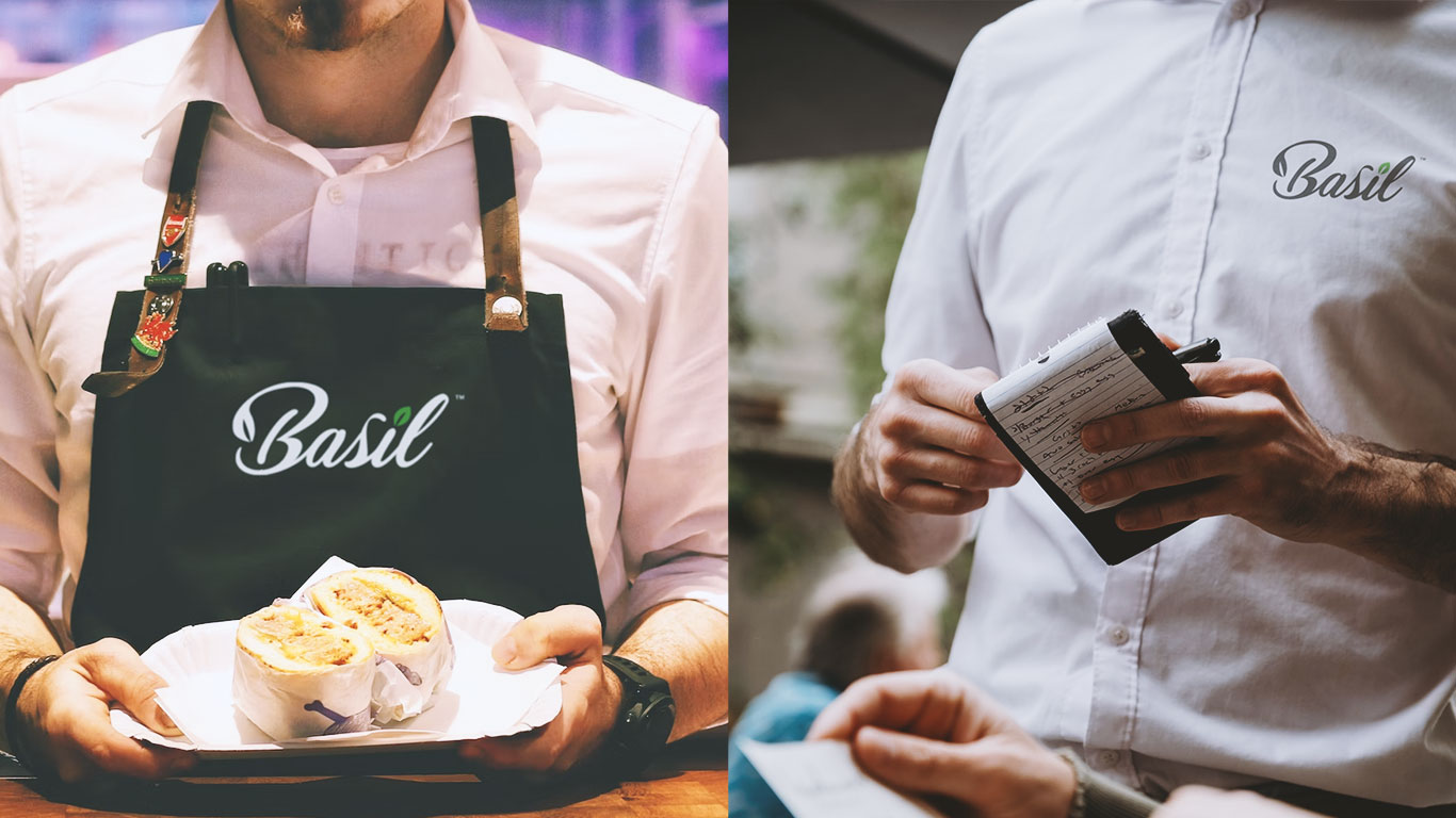
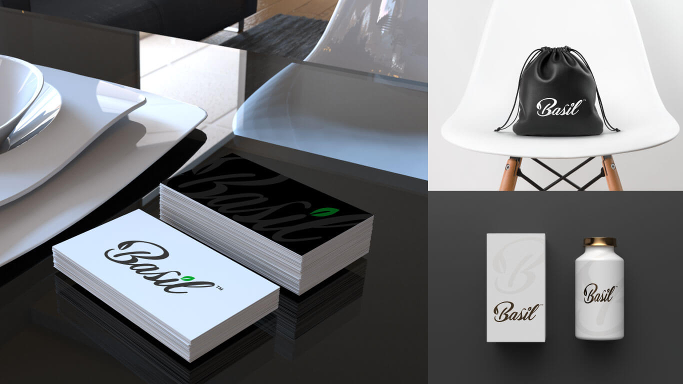
The brand identity design for Basil – A Healthy Kitchen was well received by the client and its customers. The logo and marketing collateral are eye-catching and appealing, representing the restaurant’s values and attracting its target audience. The brand identity has helped the restaurant to stand out in a competitive market and position itself as a premium, healthy dining option in Qatar.

Conclusion:
A Successful Reflection of the Restaurant's Values and Appeal to its Audience

The brand identity design for Basil – A Healthy Kitchen successfully reflects the restaurant’s core values and attracts its target audience. The use of the basil leaf and cursive font, along with the dark charcoal gray and green colors, has created a classy and organic brand identity that stands out in the market.

Client's Feedback:

We're thrilled with the brand identity that Blace Creative designed for us. Their creativity and attention to detail were exceptional, and we highly recommend them.

Blace Creative designed a brand identity that perfectly captures our restaurant’s values and mission. The use of the basil leaf and cursive font gives it a friendly, organic feel, while the dark charcoal gray and green colors represent elegance and health. Their attention to detail and creativity helped us stand out in a competitive market, and we’re grateful for their exceptional work.


Munna Al Aziri
Founder/ Basil – A Healthy Kitchen

Tailor Made for Your Needs

We've Made Hundreds of Unique Brands, Products and Design Projects.

This website stores cookies on your computer. Cookie Policy